FutureMusic: Take us under the hood as far as the sounds are concerned. How were these developed? What was your criteria conceptually? Ultimately, what types of sound were included or rejected?
Nadine: The sound design involved a few different parts: recording/editing of the samples, creating the chord progressions, creating the sample sets and effects presets and then finally, the global presets. This is a lot more than most instruments, so we started the sound design very early. Before we started recording, I had spent around six months experimenting with sounds, just listening to the way the harmonies would sound with a different sample on each note of a chord. We didn’t have any references really. As far as I know, Playbox is the first instrument to use this technique and as a result, we went through a lot of trial and error. Some sounds I thought would work didn’t and then some I thought were duds, but tried anyway, completely surprised me and sounded magical.
After around six months of experimentation, we had a pretty good idea of the sound aesthetic we wanted to go for and started creating our library. I remember the first recording session was in my friend Peaches’ and Black Cracker’s studio, where I recorded a wonderful Opera singer called Mireille Lebel. We recorded around ten vocalists for Playbox and it was one of my personal highlights. We were also lucky to record with two wonderful string players. The rest of the instruments we played and sampled ourselves. Generally the more obscure the instrument the better – but no phrases, only single notes.
FutureMusic: How did the visuals evolve?
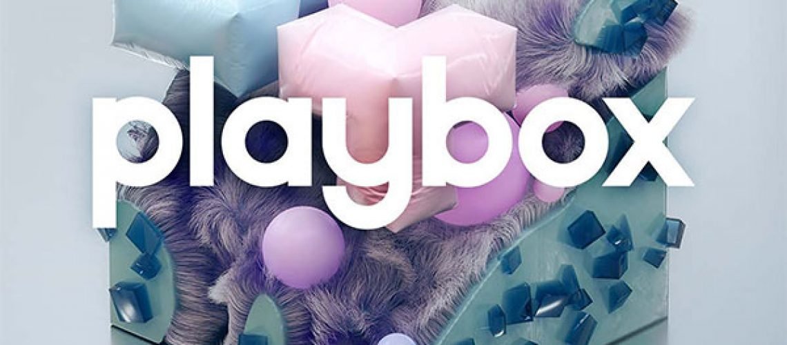
Mickael: Since the early days of development, we had a strong motivation to attach the playfulness of the instrument to the user interface. The interactions and animations had to be linked in a meaningful way so we created a visual world that would highlight the samples. We designed a set of shapes to illustrate the sample categories with some abstraction. The voice represented by smooth shapes, wobbly ones for the bass, a sci-fi vibe for the synths and so on. These were created in a generative way which allowed us to easily render hundreds of variations, one for each sample. In other words, we programmed several 3D generators and changed their parameters in random ways to realize a similar output. With all combined, you create your sound textures with a unique visual palette.
FutureMusic: The graphical elements seem to modulate slightly when changing parameters. It can be quite subtle, but interesting to see their transformation. What is the thinking behind these changes? And what do you want the user to understand sonically from these changes?
Nadine: There are around 1000 samples in the library and we wanted each sample to have its own dedicated shape beyond the category it belongs to, even if it’s just a subtle change. This partly creates the modulation you’re speaking about, because each chord can have a unique set of samples.
Mickael: The main page represents the number of samples and their categories when playing a particular chord. If you use the “spread” option on a chord, playing any of the chords would lead to a static animation. We added a slight movement in the objects to add liveliness while playing different chords in this mode.


